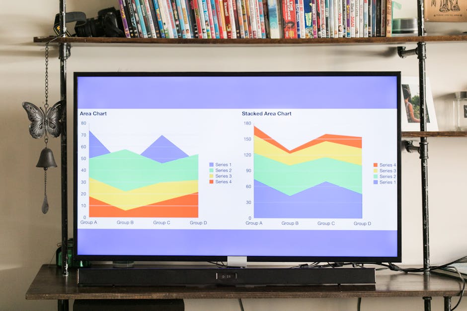
Uncovering the Dashboard Dilemma
In today's dynamic data world, many organizations face a "dashboard dilemma"—where the visual appeal of a dashboard disguises underlying data inaccuracies. For example, U.S. Government Accountability Office reports demonstrate that even with substantial IT investments, inaccuracies continue to cloud oversight. Overlooking these small yet impactful errors can lead to strategic missteps, particularly in environments that depend on automated reporting for resource management.

Key issues often identified include:
- Data Latency
- Delays in real-time reporting can result in missed opportunities and misaligned strategies.
- Widget Lock-in
- Reliance on pre-set display widgets that resist customization leading to rigidity and inflexibility in data views.
- Granularity Drift
- Slow or gradual changes in data detail can mislead stakeholders about the actual operational state.
Lessons from the Field
Historical missteps in large-scale IT projects reveal the high price of misinterpreting dashboard data. In government projects such as GAO-11-262 and GAO-12-210, inadequate dashboard designs led to misaligned strategic decisions and subsequent operational chaos. These real-world examples provide critical insights for organizations rethinking their reporting processes.
Both private companies and nonprofits can learn from these experiences by scrutinizing donor databases and grant tracking systems to ensure precision in reporting. The lessons stem from the recognition that a dashboard is only as reliable as the processes behind it.
Harnessing Data-Driven Insights
Precision in data analysis is non-negotiable. Even a minor discrepancy on a dashboard can lead to significant errors that affect resource management and overall mission execution. Detailed studies confirm that aligning automated outputs with verified sources transforms raw data into actionable insights.
Experts recommend a dual approach: combining robust software tools with human validation to ensure every data point is accurate. This method is especially beneficial when external validation tools cross-reference internal data with public records, reducing the risk of overlooking key metrics.
Click to explore in-depth methods for ensuring data precision
Some detailed steps include: regular audits of automated reports, manual cross-checks on high-impact metrics, integration of external data validation tools, and staff training to interpret and verify data discrepancies. These practices help build a resilient feedback loop that continually enhances reporting accuracy.
Credibility from the Experts
Trusted professionals assert that high-stakes decision-making requires dashboards free of errors. A notable data strategist emphasizes that "correlating data from diverse sources remains crucial. An error can jeopardize an entire decision-making process." Her insights are echoed by many who have observed a 20-30% skew in data metrics when dashboards are misaligned.
"Rigorous, iterative reconciliations, combining both human insight and automated tools, are essential for unlocking true data utility," - a notable data strategist
Such expert opinions reinforce the necessity of frequent recalibrations and robust verification protocols to maintain dashboard integrity.
Charting a New Course for Reporting Excellence
To overcome the limitations of traditional dashboards, a systematic overhaul is recommended. By aligning data streams with tailored nonprofit requirements, organizations can dramatically enhance reporting precision and operational efficiency. This involves the verification of robust data pipelines, integration of external validation tools, and the implementation of iterative cross-checks.
For instance, reconciling donor contributions and verifying program expenses before strategic decisions are finalized can preempt data anomalies. Embracing these tailored best practices ensures that dashboards evolve into true instruments of strategic clarity.
| Feature | Legacy Dashboards | Custom Reporting Layers |
|---|---|---|
| Data Refresh Rate | Typically Delayed | Near Real-Time |
| Customizability | Rigid Widget Systems | Flexible, Data-Driven Layouts |
| Validation Methods | Software-Centric | Hybrid (Software + Human Oversight) |
| Operational Efficiency | Inconsistent, Leading to Misalignments | Streamlined with Tailored Reporting |
| Note: This table illustrates comparisons applicable to diverse teams, such as asynchronous operations in Nairobi versus fast-paced coordination in Berlin. Additional considerations include integration of automated tools and staff training. | ||
By integrating these innovative practices, organizations pave the way for a future where dashboards illuminate data truly and propel strategic success.